
dBASE onLine Training
The Hands-on Project
Michael Nuwer
November 11, 2002
|
dBASE onLine Training
|
|
Custom Controls |
For the Hands-on Project we will create a set of custom controls for use with the forms used in the Pet Clinic Application. However, we do not need to start from scratch. In the Tutorial Project we have already created a set of custom controls. The Hands-on Project can re-use those controls and modify them as needed for the Pet Clinic application.
To begin, locate the MyControls.cc file that you created in the Tutorial Project. It should be in the \dBASETutorial folder. Copy this file to the main folder used for the Hands-on Project (\Pets -- or to another appropriate folder if you are storing your custom classes elsewhere).
Next we must deal with a usability issue. If you are simultaneously working on the Tutorial Project and the Hands-on Project, we must be sure the correct classes are used by the IDE. dBASE Plus can become very confused with respect to which MyEntryField class it should use. We have defined one version for use in the Tutorial and we will define another version for use in the Hands-on Project.
I suggest that you rename MyControls.cc (the one in \Pets) to MyControlsPets.cc. This will take care of duplicate file names and reduce some of the confusion.
Next we need to release from memory all the class definitions used in the Tutorial Project. You can do this in the Command Window by typing:
close all
If you want to be more selective in what you remove from memory, type:close procedure "MyControls.cc"
Finally, we need to load the custom controls that will be used with the Pets application. To do this, type the following in the Command Window:
set procedure to MyControlsPets.cc Additive
This sequence of closing and setting procedure files will need to be run each time you switch between the Tutorial Project and the Hands-on Project. You may wish to create a program file that contains these commands and double click it each time you start working with the Hand-on Project.
You will also need to execute similar commands when you switch back to the Tutorial Project. The easiest thing to do is to add the command "close all" to the top of the configure.prg file that is located in the dBASETutorial folder. Then run that program file each time you begin working with the Tutorial project.
Another possible source of confusion is that dBASE Plus might be loading the custom components autmotacally. Use the following steps to avoid this:
- Open a new form in the designer
- Select the Component Palette
- Right click the mouse and choose "Set up Custom Components..."
- If you see MyControls.cc in the list of Custom Components, then you should delete it.
The list of custom components in this window is saved in the dBASE Plus INI file and each item is automatically loaded when you start dBASE Plus. Some times this is convenient. But when you want to use two sets of custom components that have the same class names, this feature causes a lot of confusion. In such a case, it is better to load the components manually when they are needed.
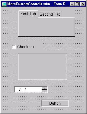
The Hands-on Project uses some controls that are not used in the Tutorial Project. These include a notebook, rectangle and checkbox controls. So we need to add these controls to MyControlsPets.cc.
I would suggest a technique similar to that used in the Tutorial Project. Create a new form, place a standard version of these three controls, and modify their properties. Change the name properties to MyNotebook, MyCheckbox, and MyRectangle. The rectangle's borderStyle can be set to "etched in" (9). These controls do not have any other special properties that need to be set.
Another Spinbox
The Pet Clinic application is going to use a number of spinbox controls that are formatted for dates. Because of this it is a good idea to make a custom date spinbox. To do this you can add a MySpinbox control to the form, and then find the value property in the inspector. Click the type ("T") button and in the dropdown list, choose "date."
You now have a new spinbox that is derived from the custom MySpinbox. Give this new spinbox the name MyDateSpinbox. Then export it to the myControlsPets.cc custom component file.
Another Pushbutton
Next, lets create a subclassed pushbutton and change it's appearance so that it looks flush (or flat) on the form. This is called a client border style. Add a MyPushbutton to the form and change the borderStyle property.
borderStyle = 7
Change the Name property to MyToolbarPushbutton. This pushbutton will be used in the toolbar that appears on the application's data forms. (See the section below on the Toolbar class.)
The Pets application is going to work and look differently than the Tutorial application. Perhaps this is because your client has different preferences. Whatever the reason, what we really want to learn is how to modify our custom classes when they are used in a different application.
There are at least two ways to do this. First, you can copy the CustomControls.wfm form from the Tutorial project to the Pets project. Then open this copy, use the inspector to make the appropriate changes for each control, and finally, export each control to the MyControlsPets.cc file.
The second technique is to open the MyControlsPets.cc file in the Source Code Editor and modify the properties directly. Since the Tutorial utilized the first method, lets use the second on here. This way you will obtain some experience with editing custom classes.
You should be able to make the changes by editing MyControlsPets.cc in the Source Editor. Here are the changes that I suggest:
Mytextlabel
Remove (or comment) the fontBold property:
// fontBold = false
Remove (or comment) the alignHorizontal property:
// alignHorizontal = 0
In this app, the textLabels are going to use a regular typeface and their horizontal alignment will be to the left.
Mygrid
Change the cellHeight property to 0.75. This will make the height of each row
in the grid narrower than in the Tutorial application.
cellHeight = 0.75
The other modification that we'll make is to remove indicator (the left-most column in the grid, which contains an icon indicating the current row).
hasIndicator = false
Control color
Another change that we will make is the color. There are many controls in the
Tutorial that use a Blue background. Let's change this to another color. The
easiest way to do this is to use the "Search and Replace" feature in the Source
Editor. On the menu, click Edit|Search|Replace Text or use Ctrl+R to bring up
the Search and Replace dialog box. In the "Find What" field enter "Blue" (without
the quote marks) and in the "Replace With" field enter "0x400080". You can replace
all instances of Blue with the new color.
Note: When you use the editor to modify a custom class, the required syntax can often be a problem. In cases where I don't know the name of a property or which value should be set, I will open new form, add the component, set the questionable property, and then view the code in the Source Editor (F12). This shows me what the required syntax should be. I will then close the form without saving it.
The Custom ToolBar
The Toolbar is also going to be changed. We are going to enable and disable the pushbuttons so that the user will know which buttons can or cannot be used. The Save and Cancel buttons will not be enabled unless the user is editing or appending a record. And, when the rowset is in edit or append mode, we will disable the New, Edit, and Delete buttons.
To do this we need to modify the MyToolBar control that is in MyControlsPets.cc. So locate the control in the Source Editor. (You should be able to find each class listed in the left panel of the Editor.)
There are three modifications that need to be made to this class. First, MyToolBar is a container that holds (or contains) each to the data buttons and the two navigation buttons. Find the class declaration line for the Save button. It looks like this:
this.PBSAVE = new MYPUSHBUTTON(this)
We are going to set a property of this button by typing it directly in the Source Editor. So, inside the with-endwith block, add "enabled = false".
   with (this.PBSAVE)
      ...
      enabled = false
   endwith
You should set the same property for the Cancel button.
Now, the default for these two buttons is disabled. When the form opens, the rowset is in "Browse" mode and the "New", "Edit" and "Delete" buttons are enabled, but the Save and Cancel buttons are disabled.
Second, we need to add a method to the MyToolBar control that will toggle the five databuttons. This method is "free standing" and will not be linked to any event. We will use the rowset "State" property to test which mode it is in and set the buttons accordingly. Add the following code to the MyToolBar class. Be sure it is added inside the class-endclass statement of the MyToolBar container. It can be added after the onClick events.
   function SetButtons
      local bEditing
      bEditing = form.rowset.state == 2 or ;
         form.rowset.state == 3
      this.parent.pbnew.enabled     := not bEditing
      this.parent.pbedit.enabled    := not bEditing
      this.parent.pbsave.enabled    := bEditing
      this.parent.pbcancel.enabled  := bEditing
      this.parent.pbdelete.enabled  := not bEditing
      return
Sometimes the syntax used to set "bEditing" in the above function requires a second look. If the rowset.state property is 2 or 3, bEditing will be set to true, otherwise bEditing will be set to false. The following will produce the same result:if form.rowset.state == 2 or ; form.rowset.state == 3 bEditing = true else bEditing = false endif
Third, we need to add code that calls the setButtons method. There are five data buttons in this toolbar and each one has its own onClick event. This is where we will call the SetButtons method. Add "this.parent.setButtons()" after the rowset method is called. For example, the code for the New button's onClick event handler will look like this:
   function PBNEW_onClick
      form.rowset.beginAppend()
      this.parent.setButtons()
      return
Repeat this for each of the five databutton onClick events.
The second change we will make to the ToolBar is to change the appearance of the buttons. Earlier you create a subclassed pushbutton called MyToolbarPushbutton. This is the class that we want to use in the Toolbar. The easiest way to modify the current toolbar code is to class name for each of the seven pushbutton objects. In the Tutorial the toolbar buttons were subclassed from the MyPushbutton class. The PBNew button, for example, looks this:
this.PBNEW = new MYPUSHBUTTON(this)
To modify this so that the new MyToolbarPushbutton is used as the class template for the pushbutton objects, we will edit the line to look like this:
this.PBNEW = new MYTOOLBARPUSHBUTTON(this)
You should replace "MyPushbutton" with "MyToolbarPushbutton" for all seven pushbutton objects in the Toolbar class.
Conclusion
Many other modifications could be made to our custom components. But the most import idea that you should learn from this project is that existing custom controls can be reused in a new project and, if needs, relatively simple modifications can be made that will change the behavior and/or appearance of that project.
The Legal Stuff: This document is part of the dBASE onLine Training Program created by Michael J. Nuwer. This material is copyright © 2001-2002, by Michael J. Nuwer. dBASE, dBASE Plus, dBASE SE and dB2K are copyrighted, trademarked, etc., by dBASE, Inc., the BDE (Borland Database Engine) and BDE Administrator are copyrighted, trademarked and all that by Borland Software. This document may not be posted elsewhere without the explicit permission of the author, who retains all rights to the document.